Stouffer’s.
Case Study: design strategy, identity, & packaging system.
about
Founded in 1924, Stouffer's revolutionized the industry by freezing its popular menu items for home consumption, becoming a leader of comfort meals in the frozen aisle.
creative team
In-House Strategic Design: Tom Davie
Design Studio: Sterling Brands
Brand Identity Lettering: Lux Typo.
Product Photography: Wright Studio
business & brand impact
Post-redesign launch, the brand saw quarter over quarter sales growth in 2025. With positive relevancy signals for the 100-year-old legacy brand, such as attracting younger shoppers to category.
deliverables:
• Refreshed brand identity • Portfolio architecture • Packaging redesign • Hero product photography • Digital shelf & omnichannel photography assets • Exceeded qualitative & quantitative performance requirements
brand identity
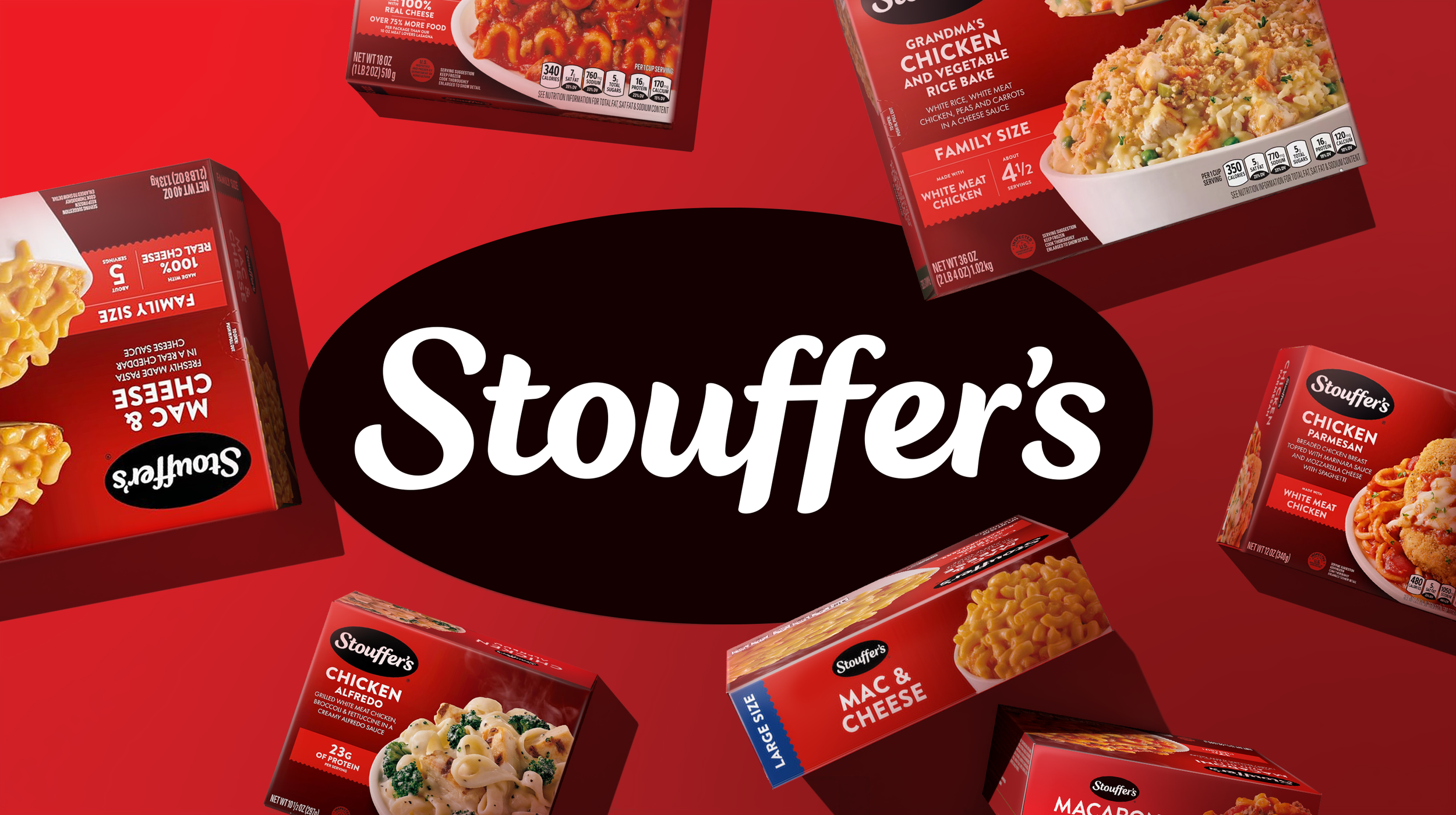
The updated logo features an elevated simplicity with typography that conveys comforting strength and a humanist appeal. The highly recognizable black oval asset was maintained, but with an improved 20% size increase in brand name visibility within the identical footprint.
packaging
Stouffer’s wanted to embrace the brand’s comfort offerings, while improving relevance with younger shoppers. We achieved this through improved communication shoppability, brand presence and product photography across 90 SKUs within single serve, multi serve and sides offerings. Making Stouffer’s the largest, and most valuable brand within the Nestlé Frozen portfolio.
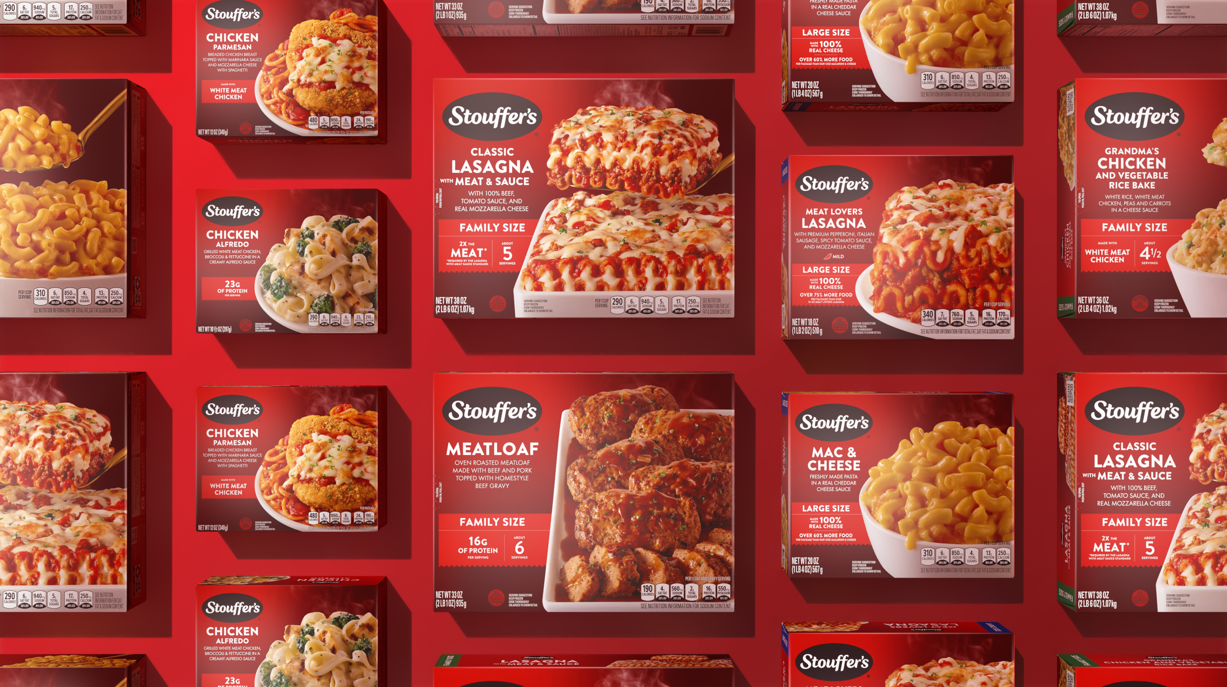
photo © Sterling Brands
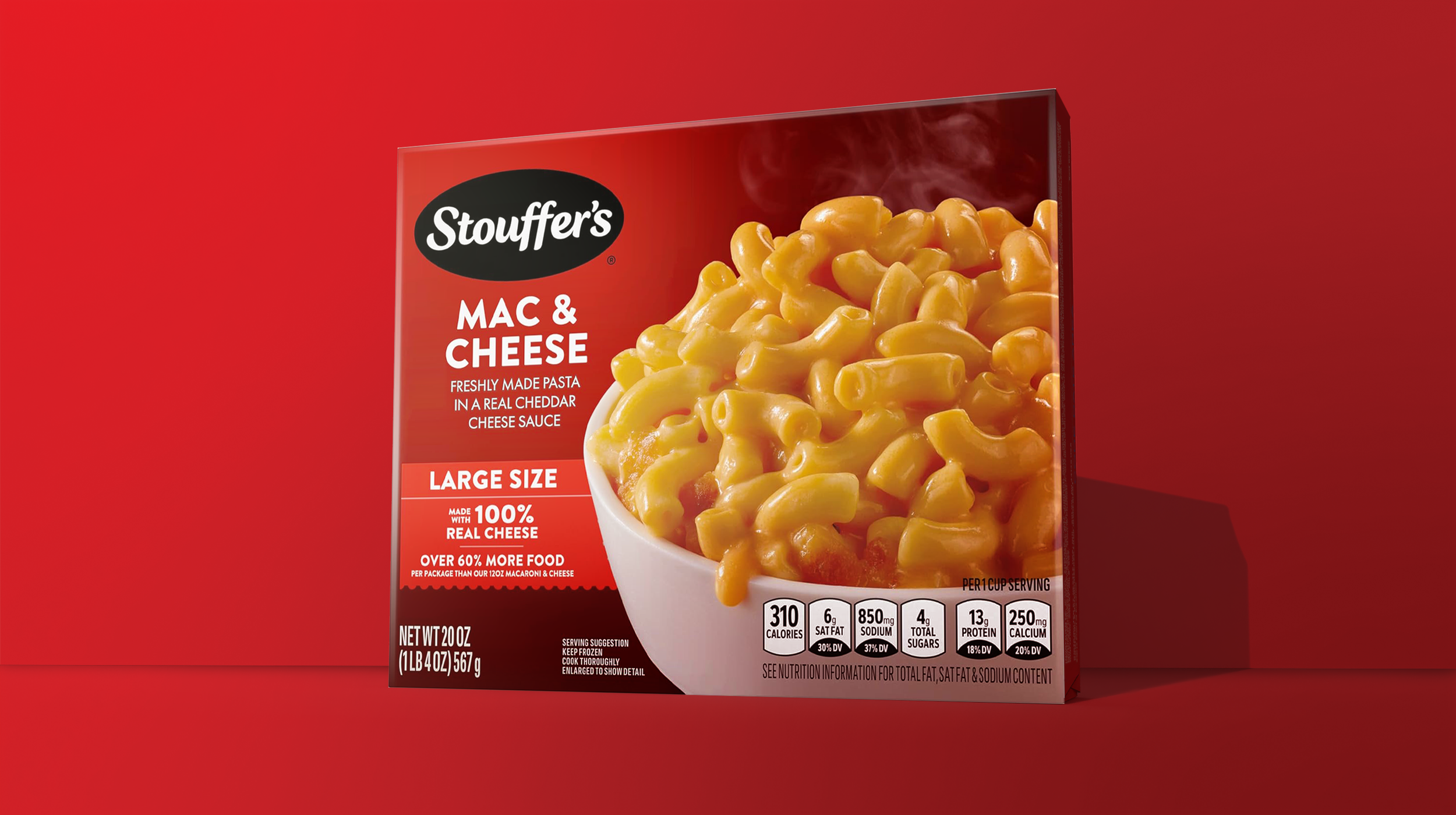
photo © Sterling Brands
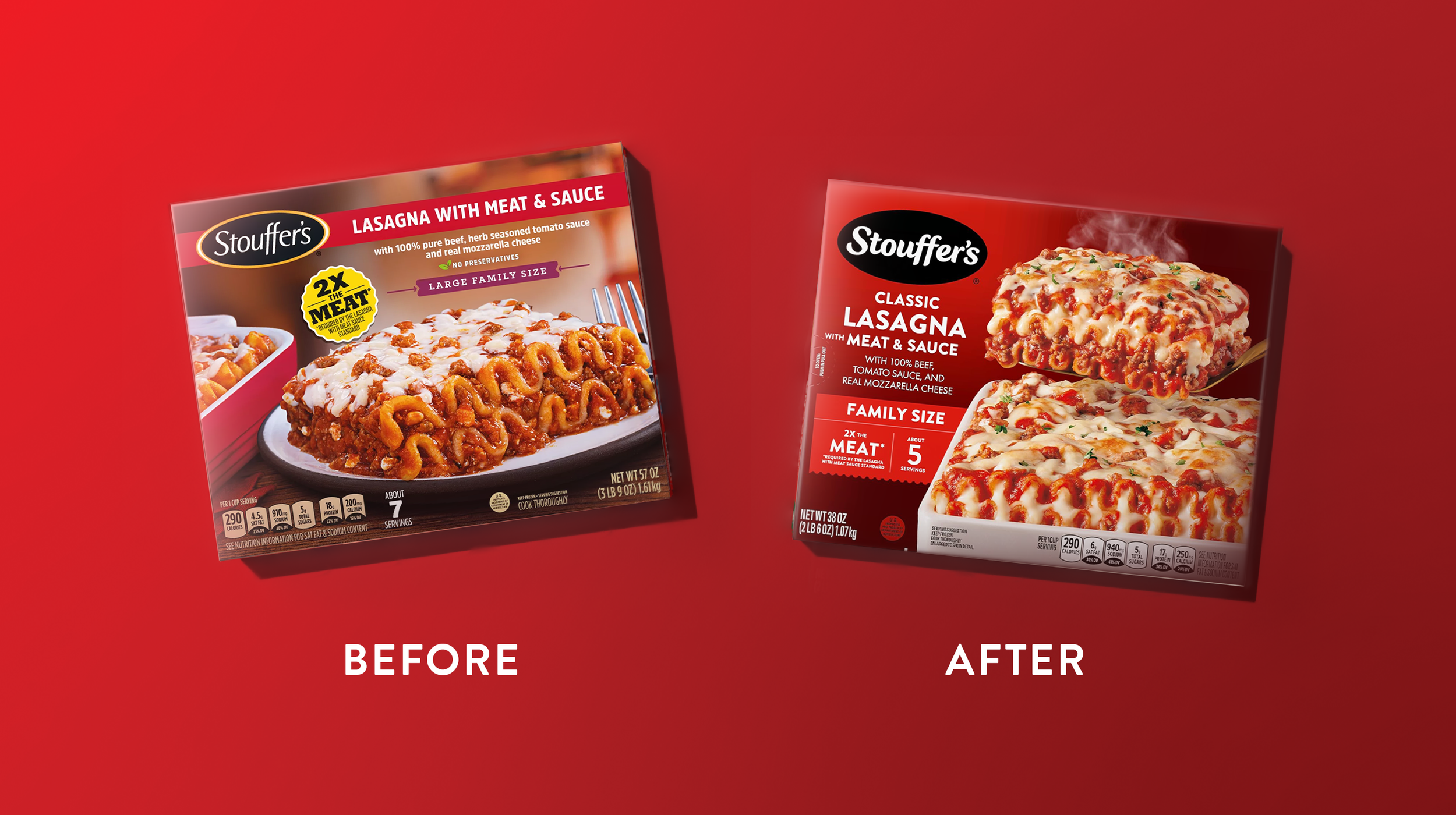
photo © Sterling Brands
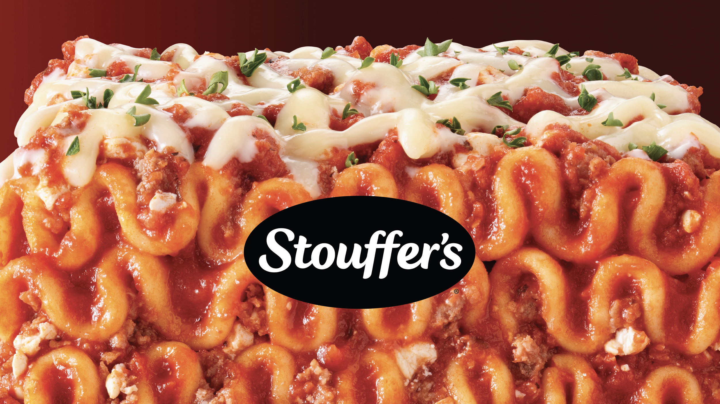
photography
The photography exploration was extensive and thorough. Many approaches, that included camera angle, lighting, propping and styling distinctiveness, were tested for consumer delight and packaging system integration.
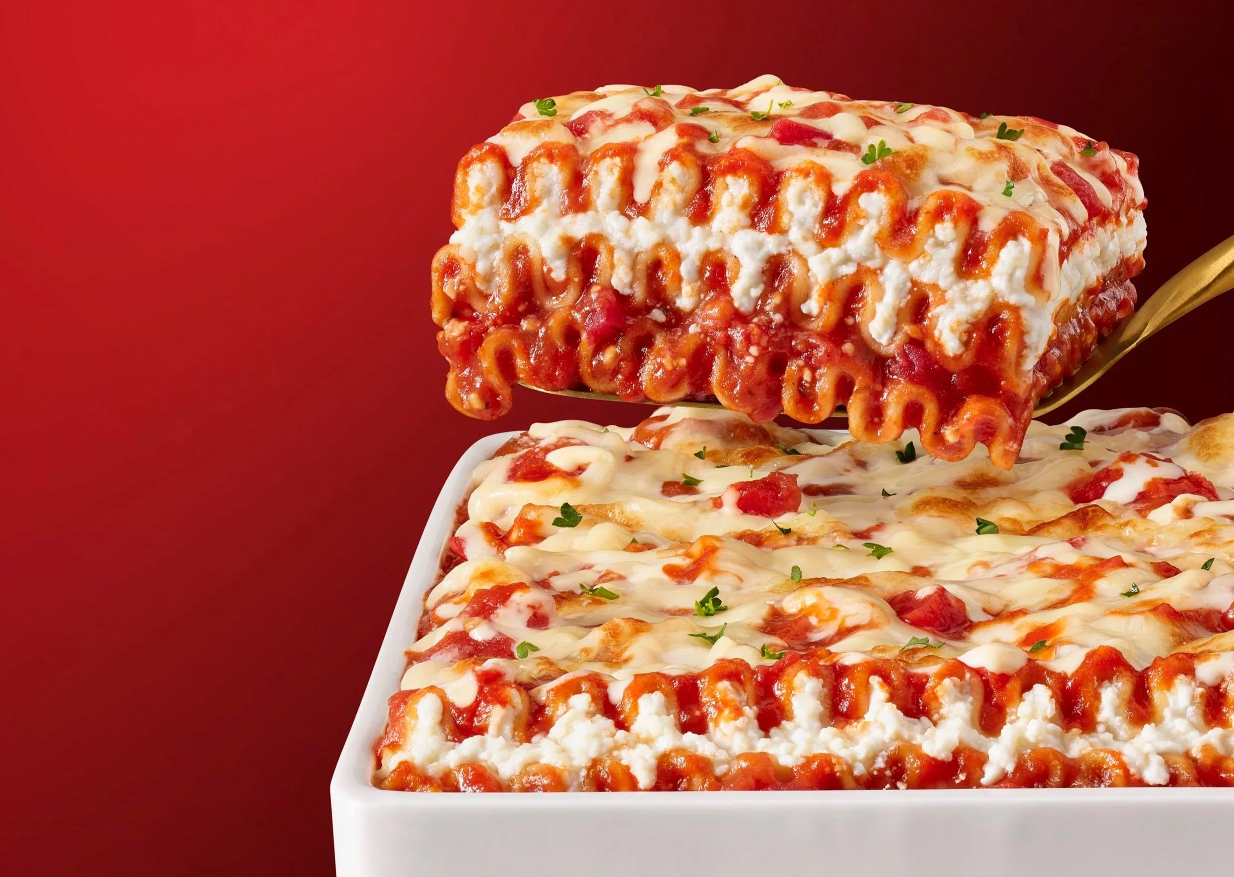
photo © Wright Studio
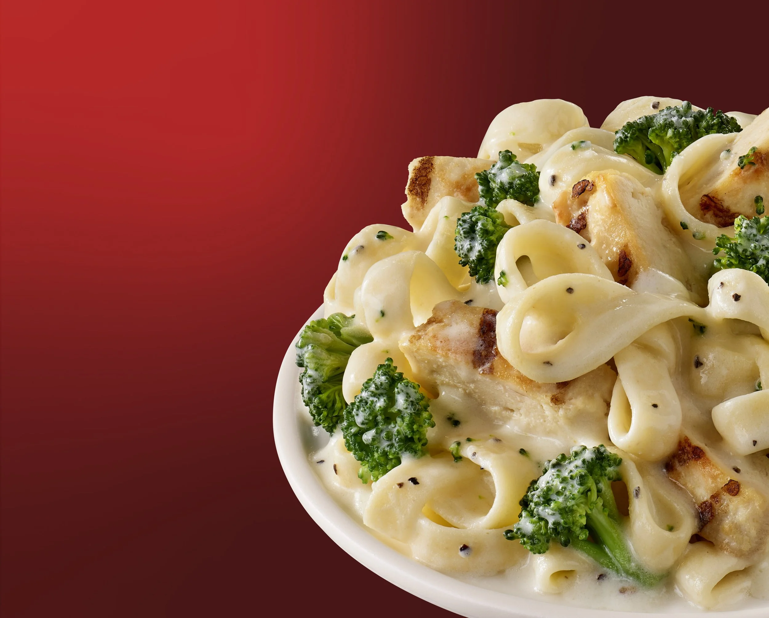
photo © Wright Studio
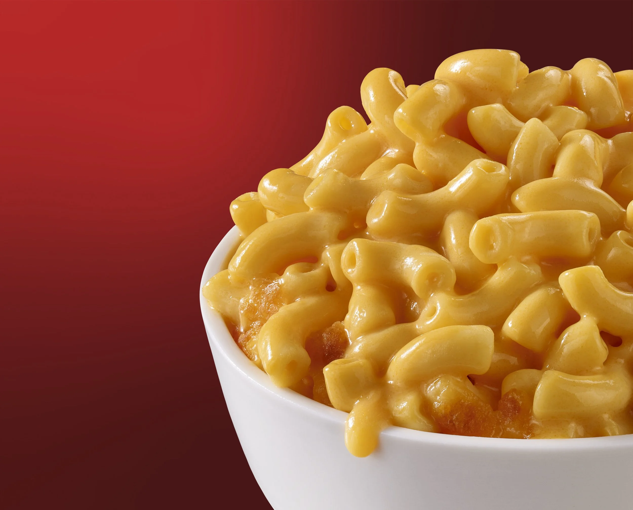
photo © Wright Studio
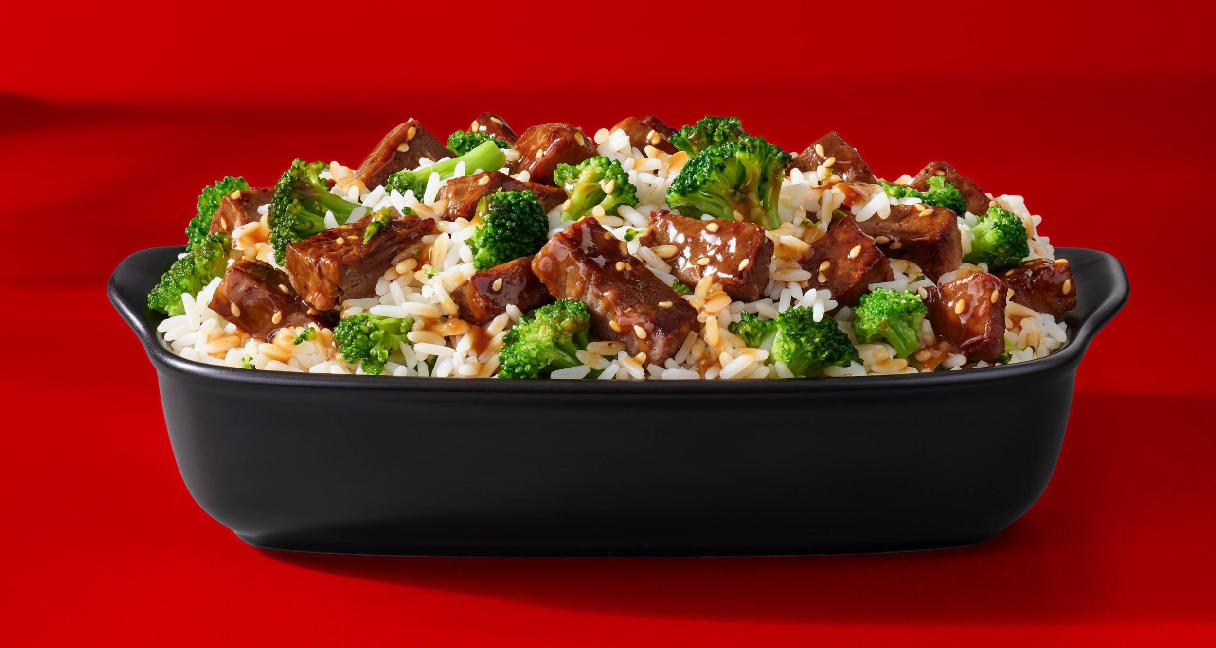
photo © Wright Studio
results
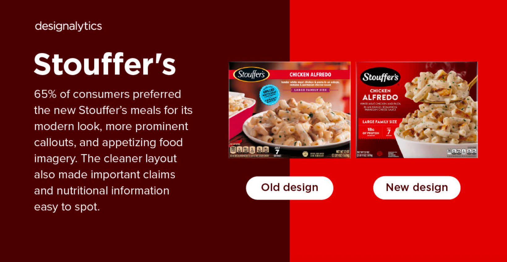
After extensive qualitative and quantitative research testing, Designalytics confirmed through independent consumer feedback that 65% to 35% preferred the redesigned packaging and photography approaches.