Hot Pockets.
Case Study: design strategy, identity, packaging system, brand standards & product photography.
about
Created in 1980 by Paul and David Merage. Hot Pockets is a beloved generational snack that has a cult following among gamers, teens and internet memes.
creative team
In-House Strategic Design: Tom Davie
Design Studio: Interact Brands
Brand Identity Lettering: Lux Typo.
Product Photography: Wright Studio

business & brand impact
In the six months following the launch of the new design, Hot Pockets’ sales increased by 39% compared to the same period during the prior year.
deliverables:
• Refreshed brand identity • Packaging redesign • Hero product photography • Creative assets aligned with updated brand positioning • Digital shelf & omnichannel photography assets • Updated brand standards • Creative strategy workshops • Mascot update and standards • Exceeded qualitative & quantitative performance requirements
brand identitY
The holding shape around the brand name was an essential asset that was enhanced by making it bolder with a familiar curvature, as if it's literally the opening of a Hot Pocket. Custom lettering was commissioned for a more modern, playful vibe, adding personality, especially the ‘k-e-t.’ A reference to the melting cheese and intermingling of the ingredients.

© Nestlé USA
PACKAGING
Hot Pockets no longer wanted to appeal just to the buyer, but to the eater as well. Specifically 13–17-year-old video game enthusiasts. With a subtle shift of the camera, and a stacking of the product, consumers can now see so much more of what makes this product delicious. The packaging redesign was reflected across the entire brand portfolio, more than 50 SKUs within three segments that include different ingredients and crust flavors.
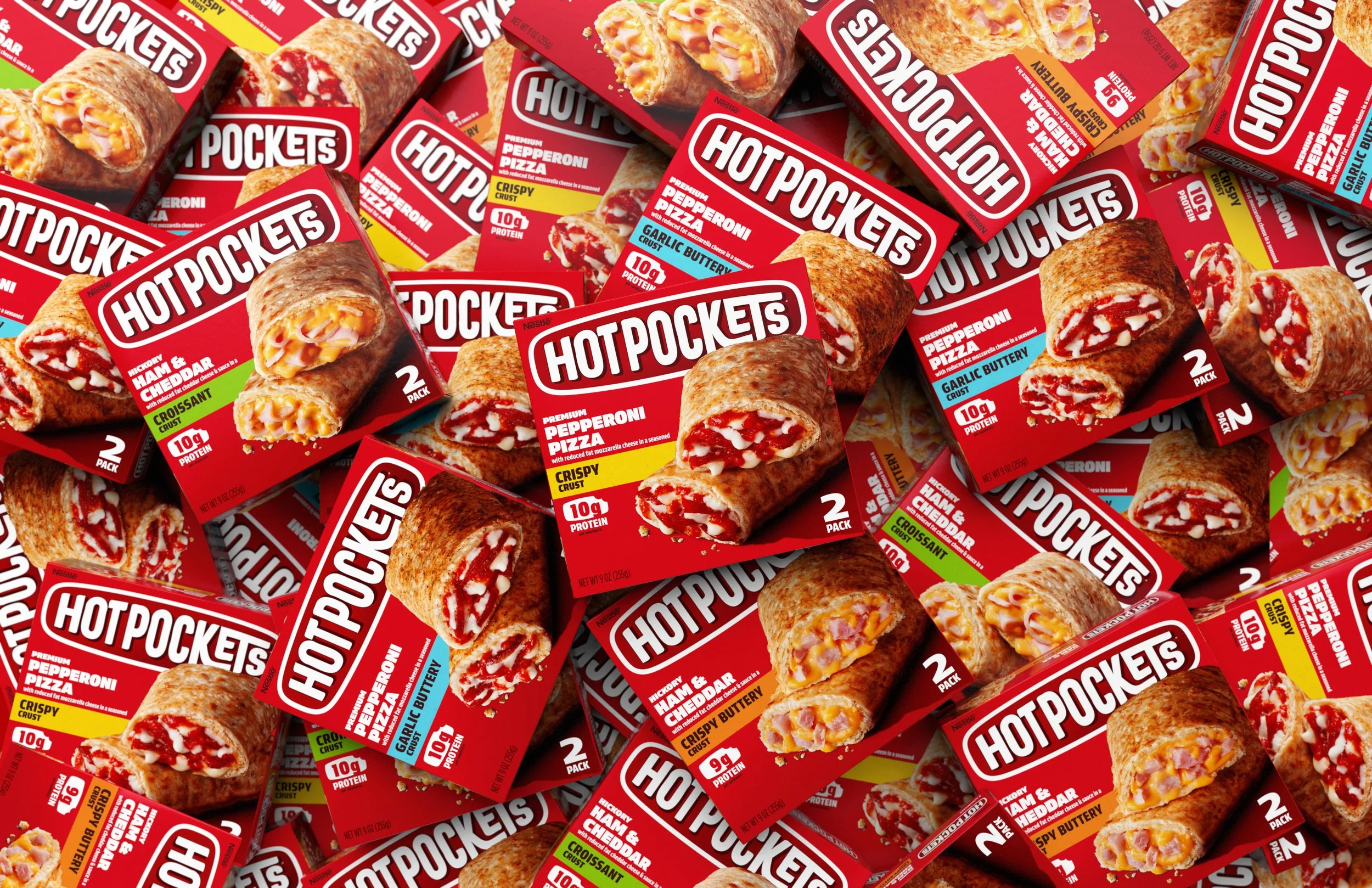
photo © Interact Brands

photo © Interact Brands

photo © Interact Brands
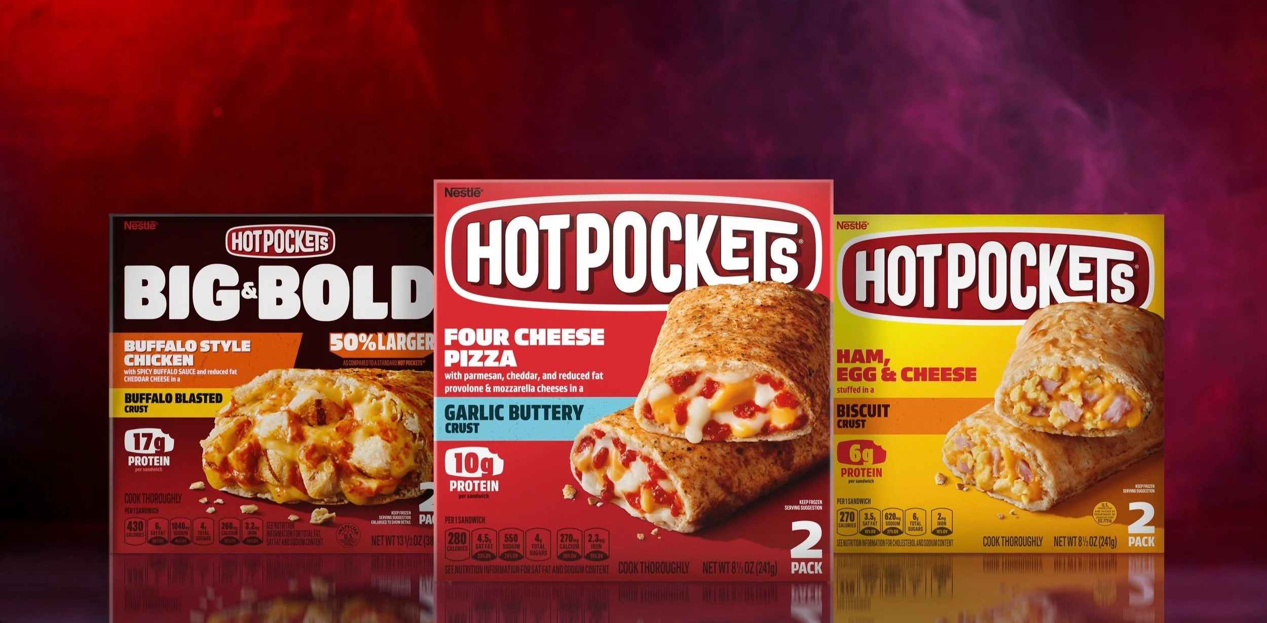
photo © Nestlé USA
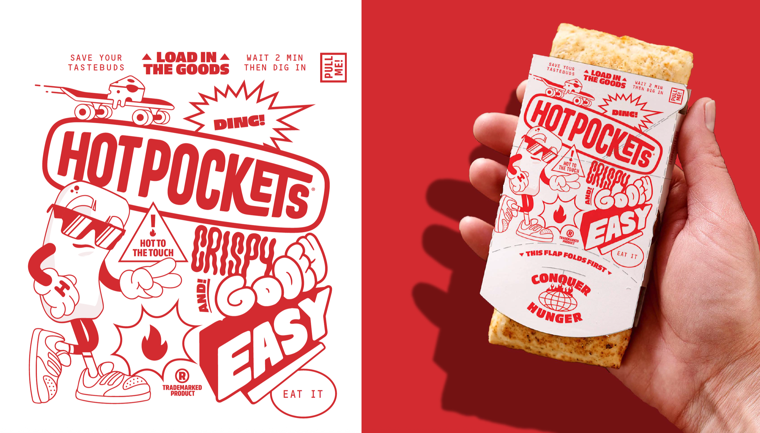
photo © Interact Brands
brand standards
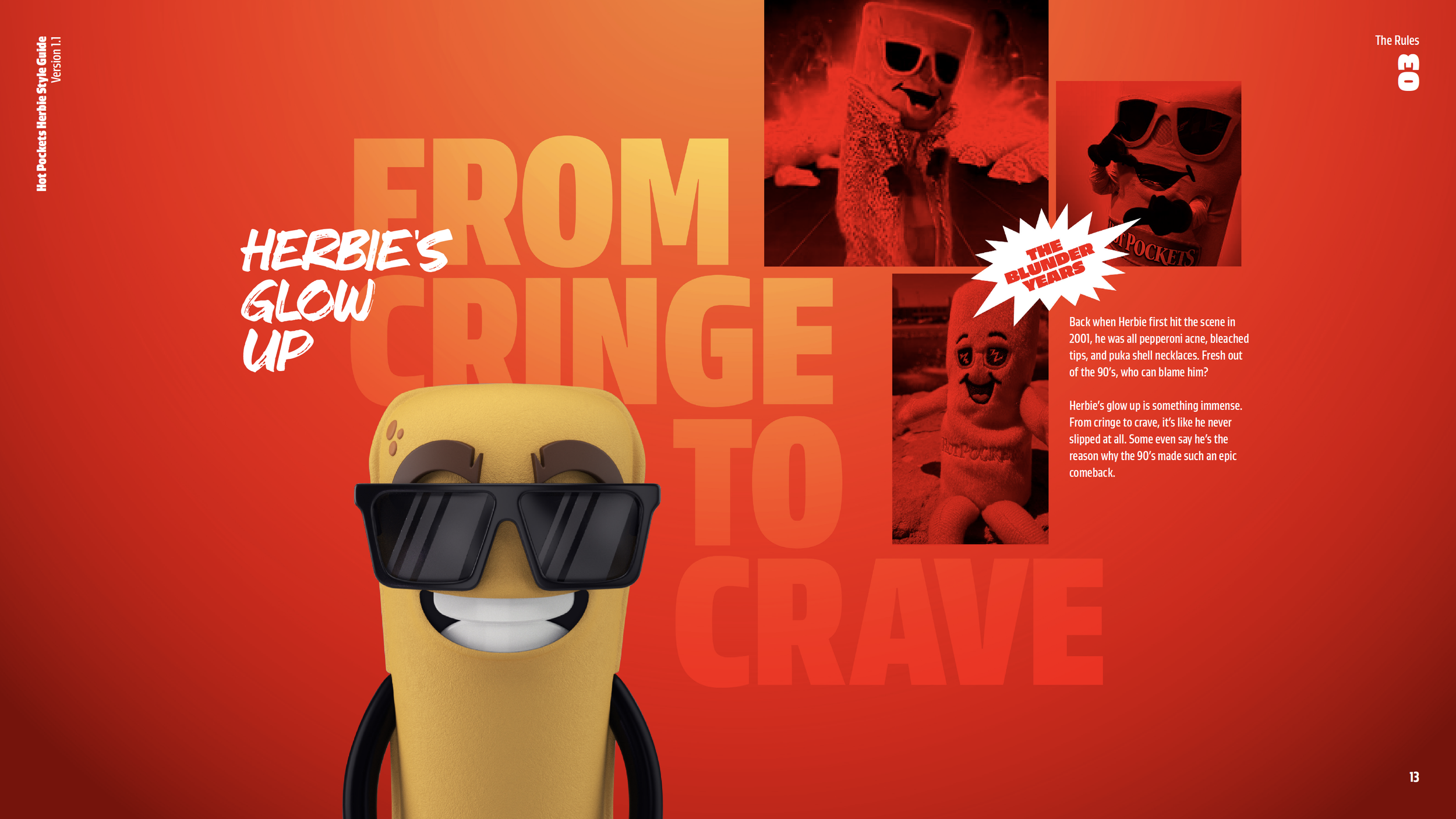
As part of the brand redesign, updated standards for both the Hot Pockets brand and mascot ‘Herbie’ were created. The standards were critical for the brand as the positioning shift was significant, and the number of agency and influencer partners were numerous. The standards included documents such as consumer portraits, brand purpose and essence, brand properties, character personality and product portfolio. The standards have a dual purpose of on-boarding creative partners and brand team members, while also establishing visual and comms tone and personality for omnichannel work.
© Nestlé USA
© Nestlé USA
photography
The photo shoot for the redesign was extensive. More than 50 hero front-of-pack product shots, per-product digital shelf assets, and hundreds of gamer-inspired lifestyle images were captured and delivered.
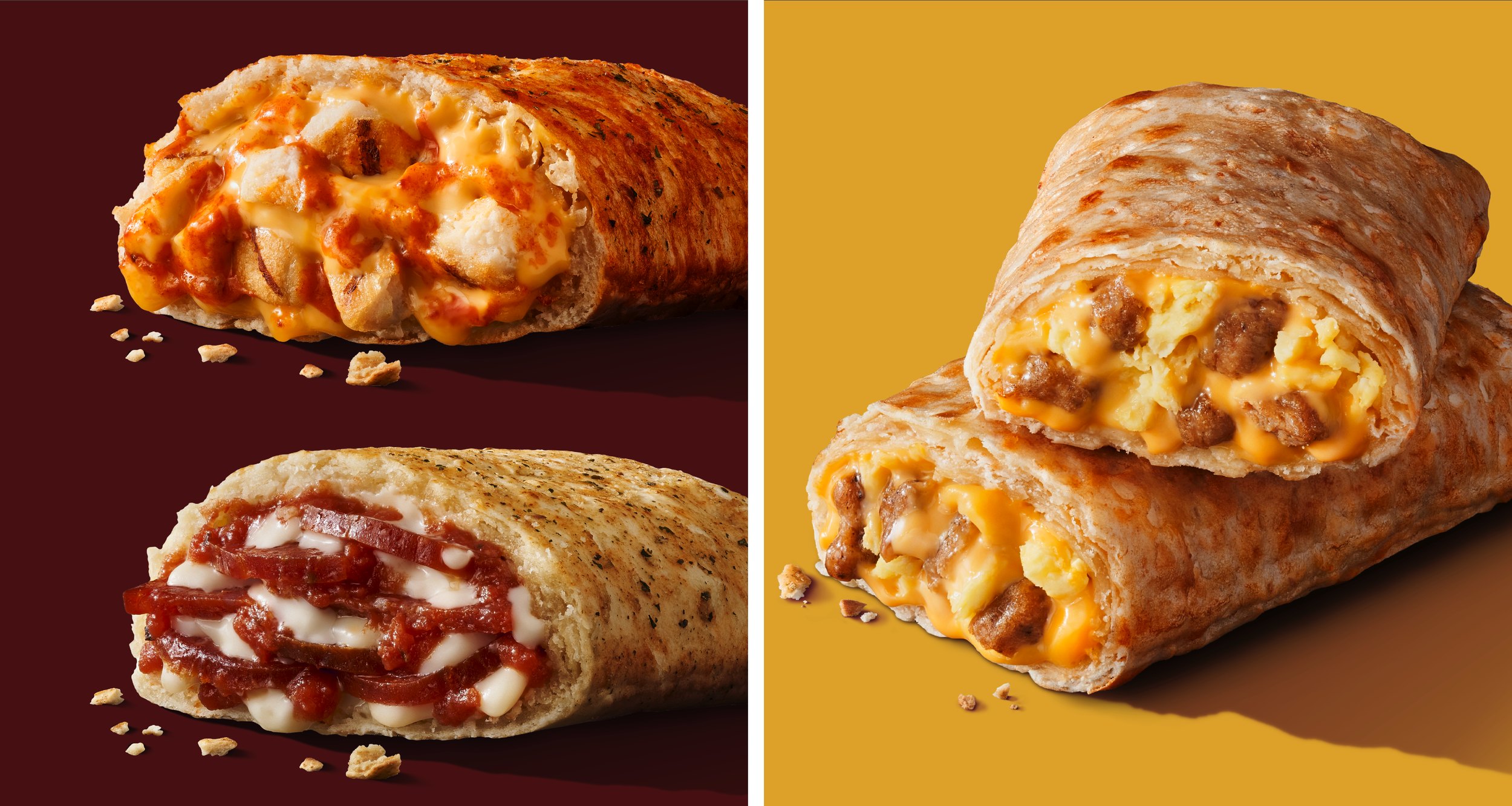
photo © Wright Studio
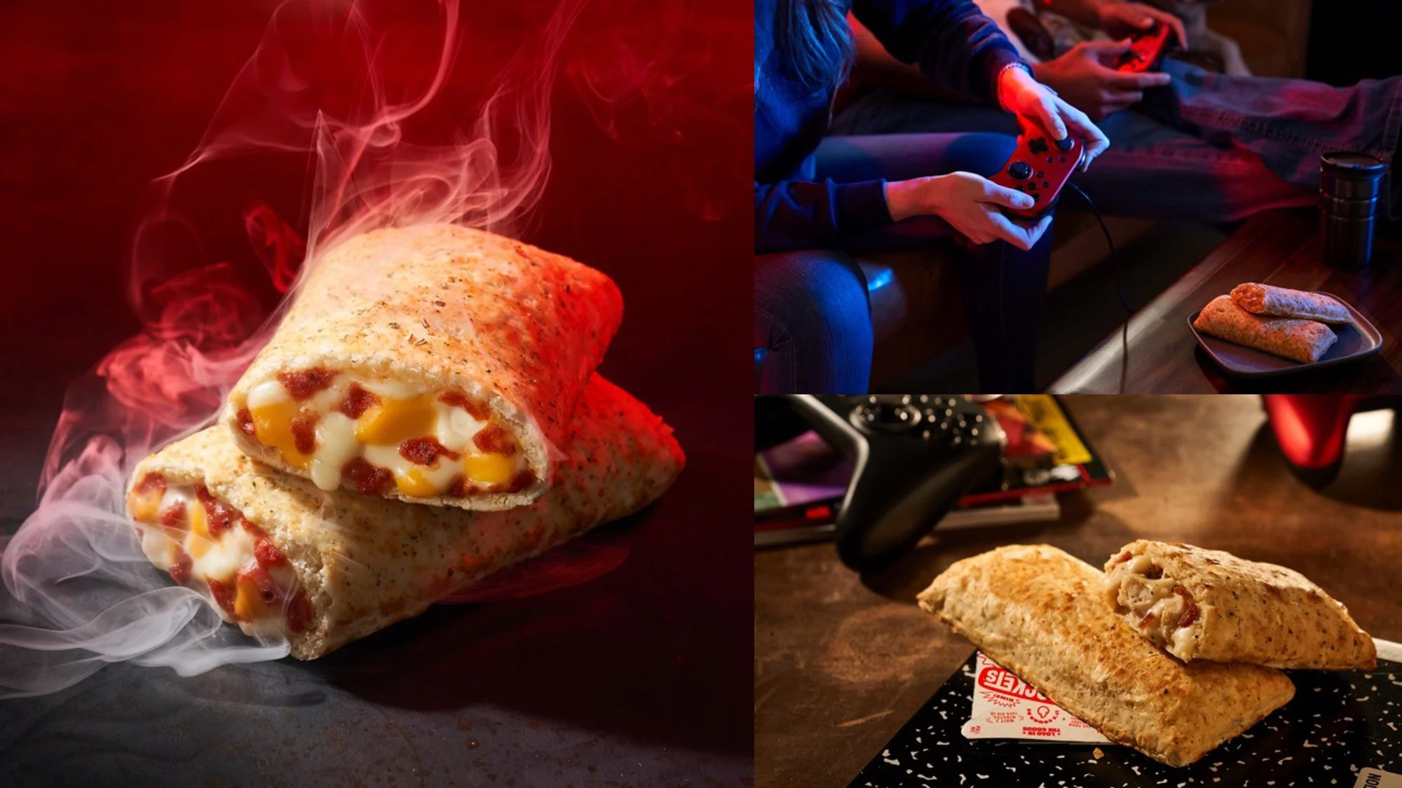
photo © Wright Studio
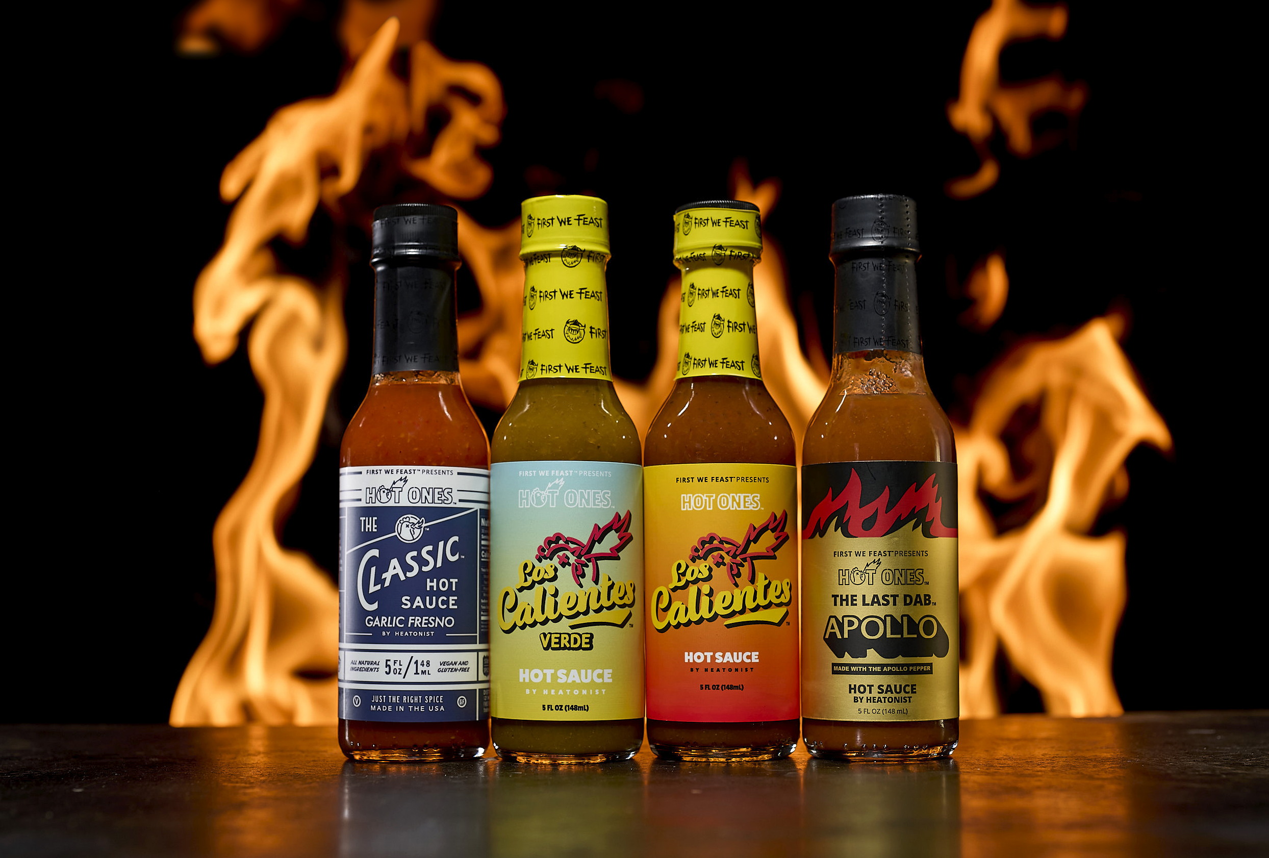
photo © Wright Studio
lifestyle
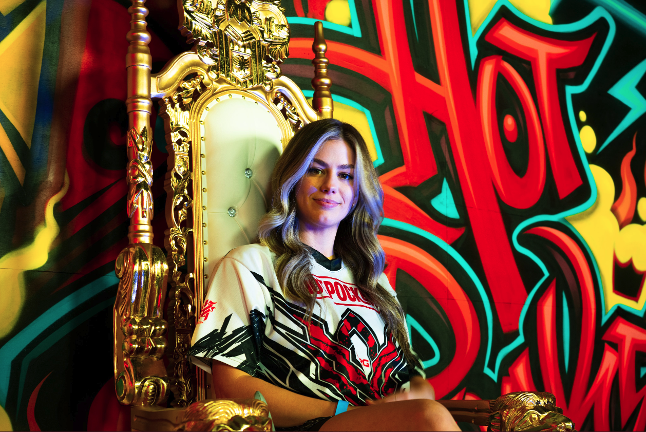
The new brand assets were rolled-out to the larger brand ecosystem, including: experiential events; swag and merch; social; and omnichannel activations.
© Nestlé USA
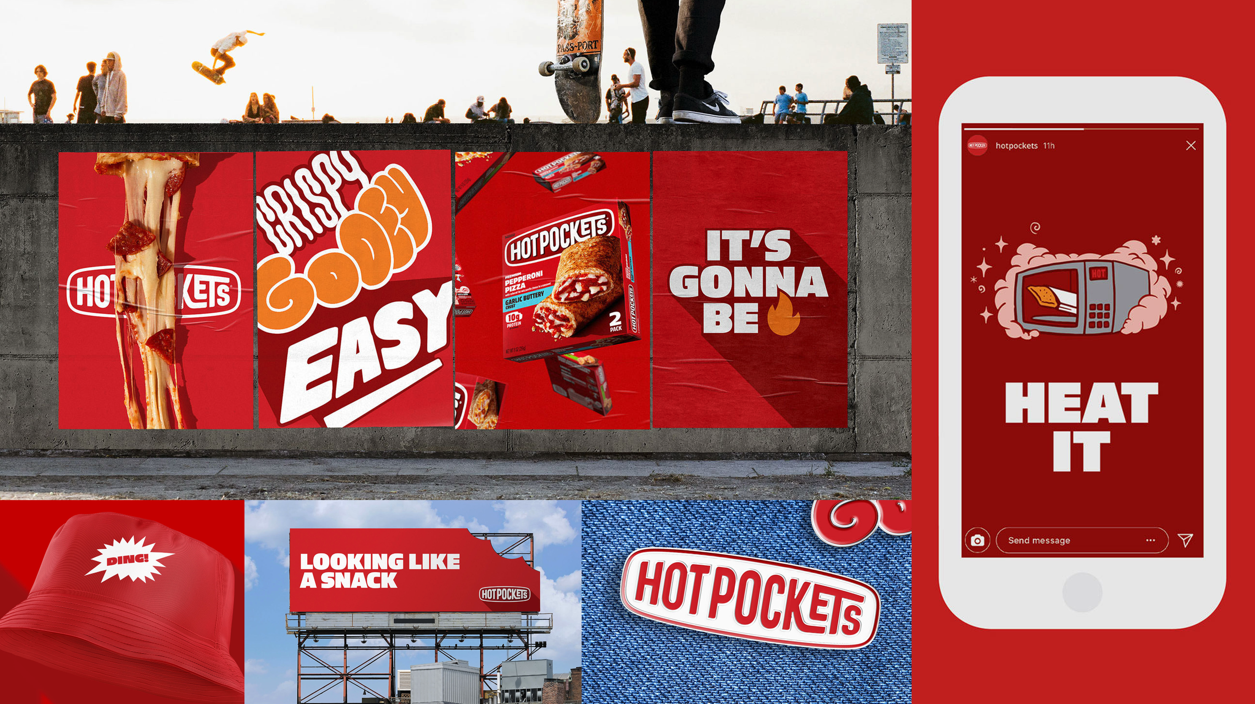
photo © Interact Brands
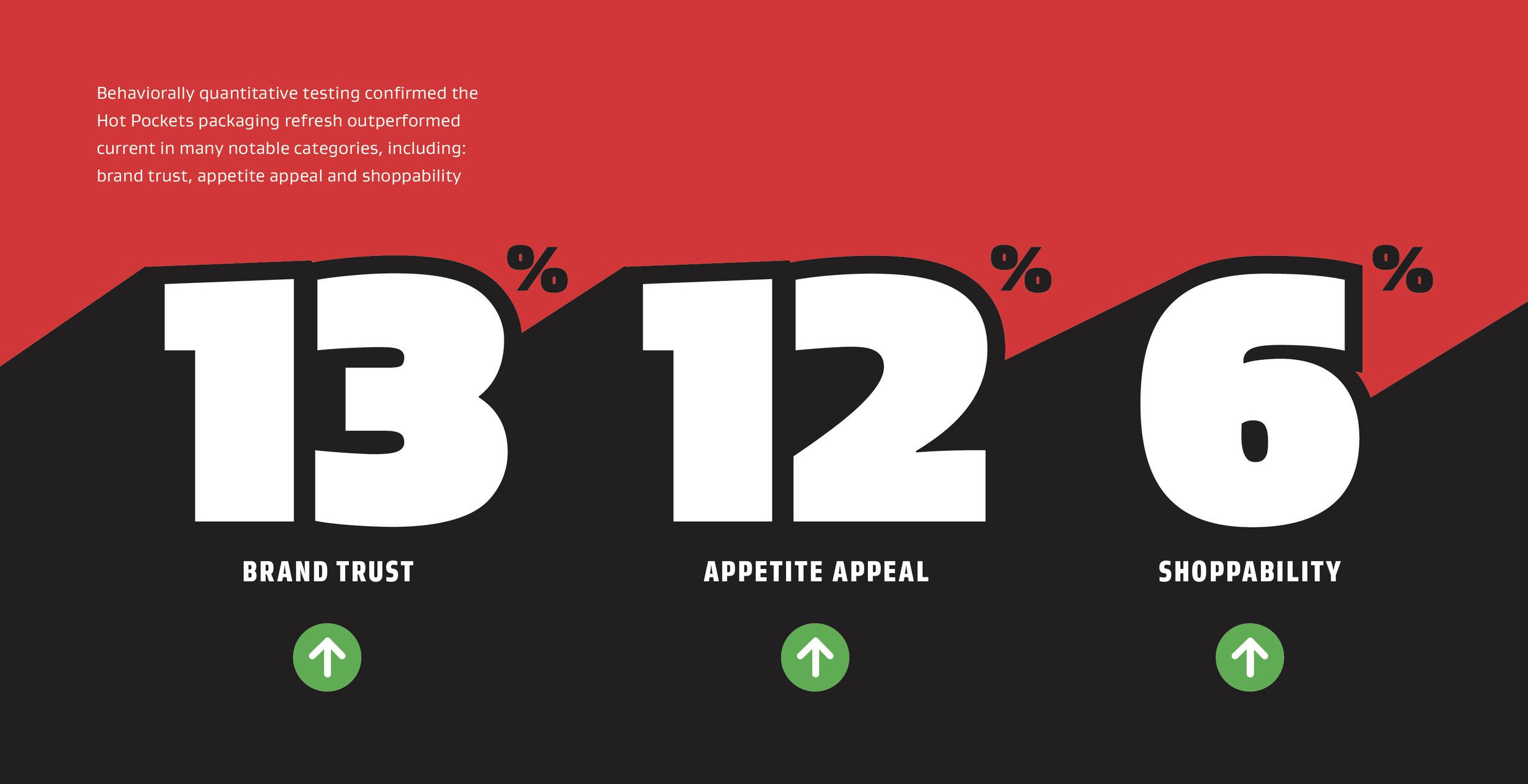
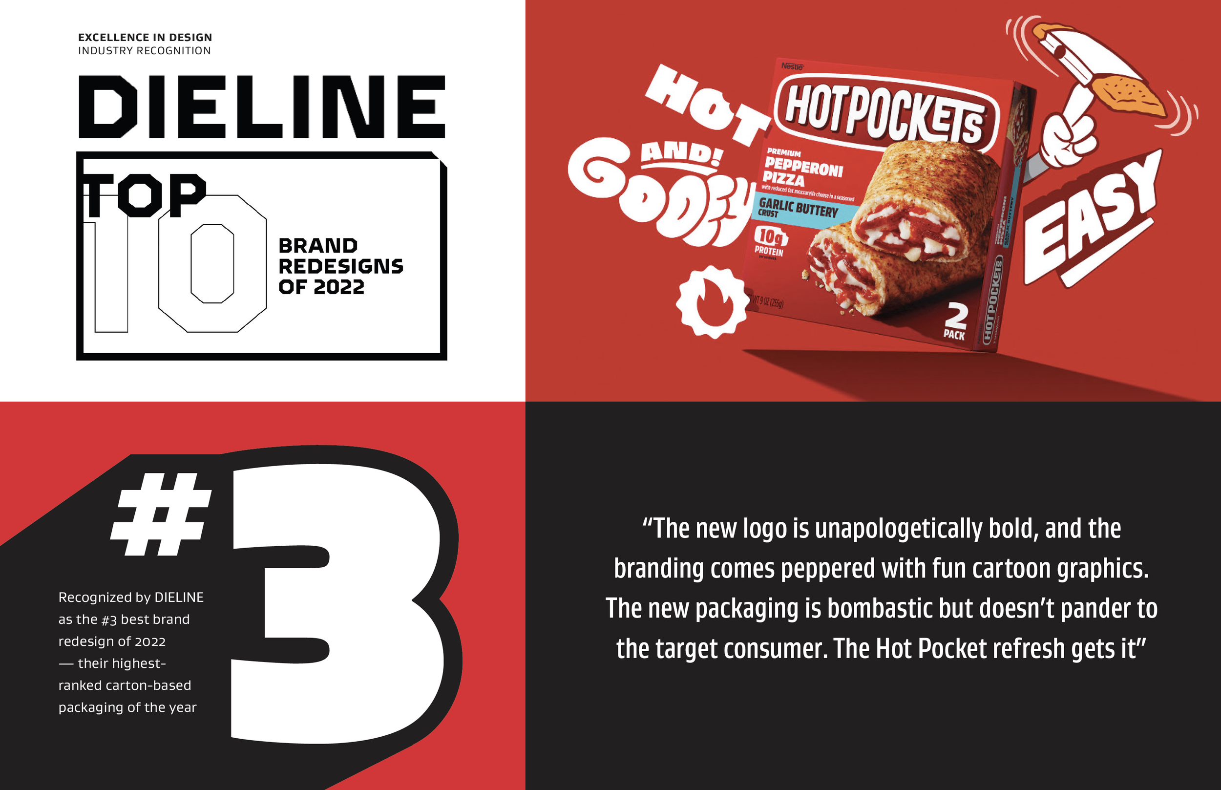
consumer insights & recognition
Conducted as a Behaviorally Quantitative test, the redesigned packaging revealed significant gains in Brand Trust, Appetite Appeal and Consumer Shoppability. Dieline awarded Hot Pockets the #3 brand redesign of the year.